
Five Visual Strategies for Communicating Scientific Concepts
When we think about science communication, we often focus on words: articles, reports, presentations, papers, and explanations. Yet much of the information we encounter and remember is visual.
Visual communication can help attract attention, clarify complex ideas, reveal invisible processes, create emotional connections, and bridge gaps between disciplines and audiences. Whether we are communicating research to policymakers, students, or the general public, visuals can often make information easier to understand and remember.
However, visual communication is not only about producing final illustrations. It is also connected to visual thinking: using sketches and visual exploration as tools to organize ideas, identify relationships, discover gaps, and develop concepts.
Whether we are creating a final visual communication or simply using visuals to think through a problem, certain visual approaches can help make complex topics clearer and more accessible. Here are five simple visual strategies that can help transform complex concepts into visual communication.
(All the following examples shown are drawn from projects I have developed over the years. They demonstrate how different visual strategies can be adapted to different communication goals and topics).
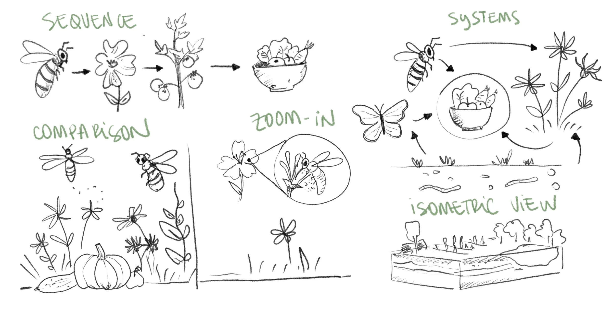
Sequence and Flow
Some ideas are easier to understand when they are presented as a process. A sequence shows how one event leads to another. Arrows can guide the viewer through different stages, helping communicate change, causality, or movement.
This approach works particularly well for biological processes, environmental systems, workflows, and cause-and-effect relationships.

Systems and Interactions
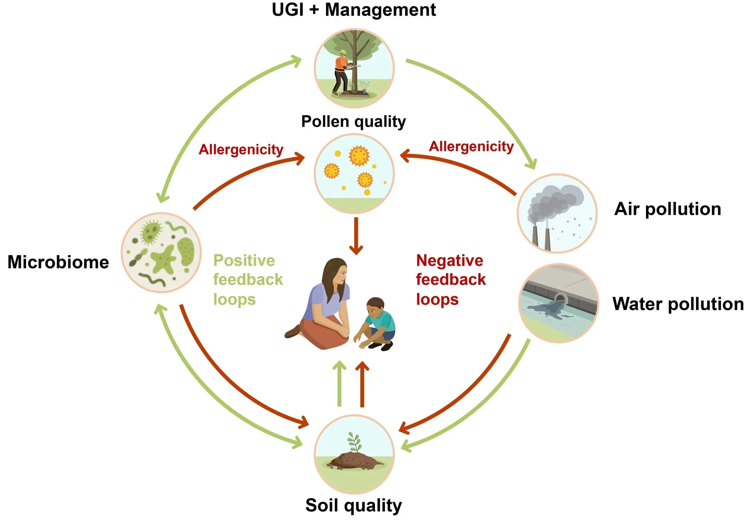
Not all topics follow a simple sequence. Many topics involve networks of relationships and interactions.
In these cases, a systems view may be more appropriate.
Instead of showing a linear process, the visual focuses on connections between different elements.
This approach is particularly useful when communicating complexity without reducing a topic to a single cause.
Comparison
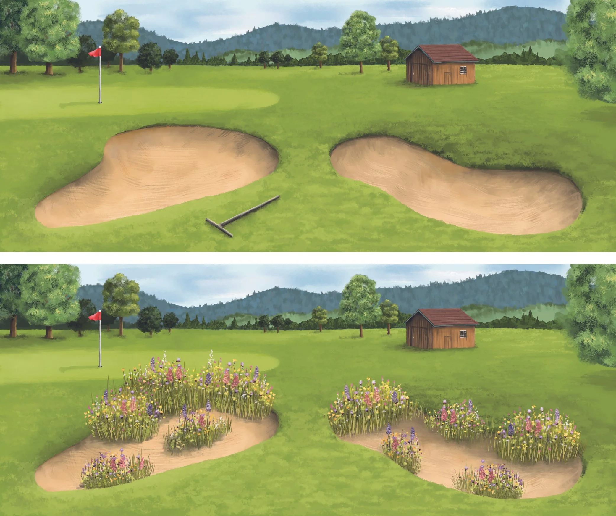
One of the simplest and most powerful visual strategies is comparison. Showing two situations side by side allows viewers to quickly identify differences and understand change. For example:
Before and after
With and without
Scenario A versus Scenario B
A simple comparison can often communicate more effectively than a long explanation.
Zoom In
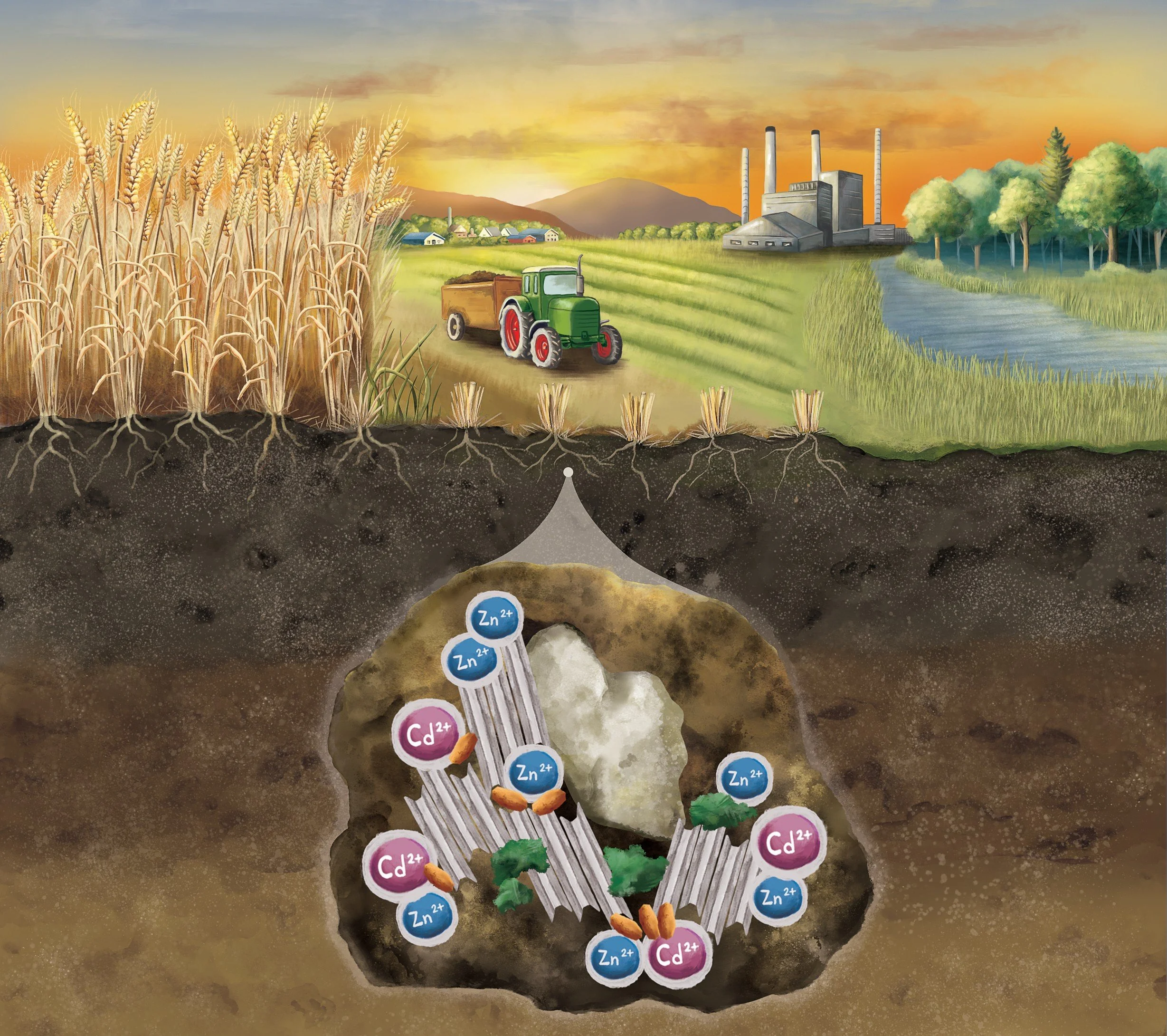
Sometimes the most important part of a process is hidden. A zoom-in allows us to move between scales and reveal details that would otherwise remain invisible.
This strategy is particularly useful when communicating microscopic processes, ecological interactions, anatomy, underground systems, or other phenomena that cannot be observed directly.
Isometric View
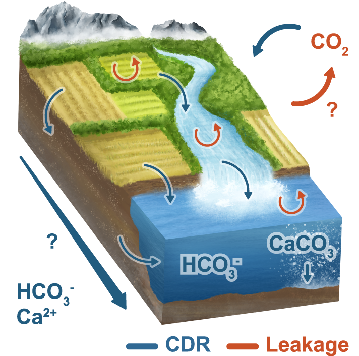
Some topics involve multiple processes, layers, or interactions happening at the same time. By showing a scene from an angled perspective, allow viewers to see different elements and their relationships simultaneously. They can combine visible and hidden processes, helping explain how different parts of a system connect and interact.
This approach is particularly useful for communicating urban systems, environmental processes, infrastructure, landscapes, and other topics where context and relationships are essential.